Learning power point is very fun
Power point is easy to learn
We can show our creativity using PowerPoint
power point is the best way to exchange the information and present information to other people in more interactive way
Slide Master: Slide Master is one of the most advanced features of PowerPoint and many of us benefit from it one way or another. This is because this feature is quite important for making PowerPoint templates, which all of us love using without a second thought. After all, why would anyone design their slide deck from scratch!
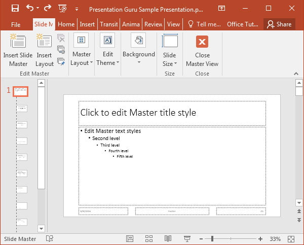
A Slide Master is a slide which contains information about the whole theme. It is the top slide which contains information about the background, fonts, colors, placeholders, etc.
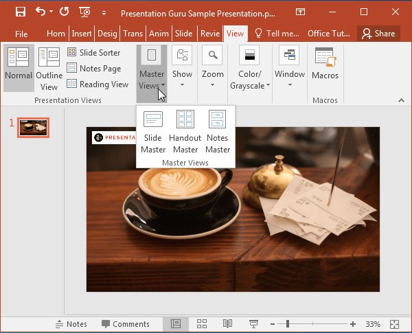
Every presentation is supposed to have at least one Slide Master, which is why it becomes so hard for some users to modify individual slides with different background designs. This is because changes made to the slide master applies universal changes to every slide in the presentation. You can modify slide master by going to View –> Slide Master, located in the Master Views menu.
In very simple word we can customize or make our own theme or template like things in PowerPoint
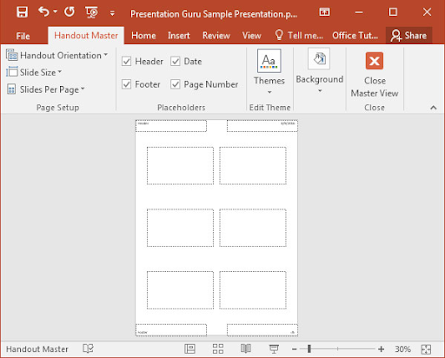
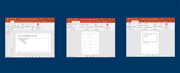
in the view tab we can even see the handouts master
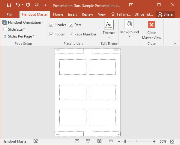
Handouts Master: There is also a Handout Master and Notes Master. As the names suggest, these options allow you to enter master view for managing the layouts for your handouts and notes. As you might be aware, you can print handouts in PowerPoint to give a copy of your slides to people in your audience. With the Handout Master option, you can comprehensively edit the layouts for your handouts.
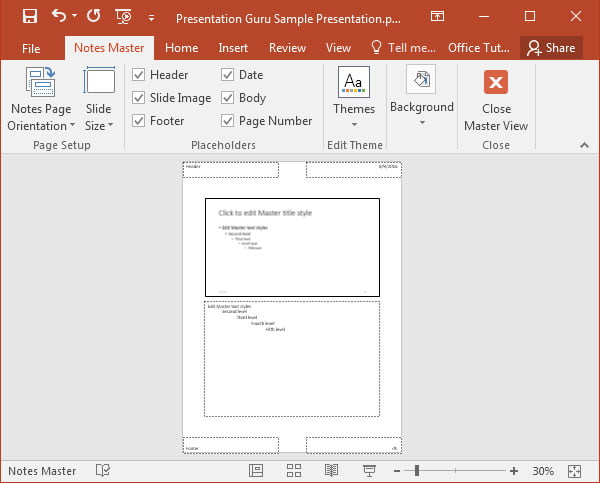
Notes Master: Some presenters like using speaker notes to remind them of key points tied to their slides. Using Notes Master, you can even make more than just text based notes by adding background styles and themes.
ANIMATIONS & TRANSITIONS
Animations and Transitions are one of the most underused features of PowerPoint. These can be used for making animated presentations, where you can load slides and slide elements with the help of various effects.
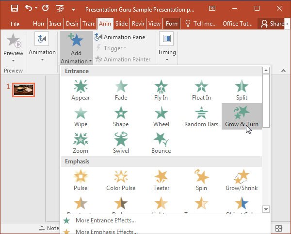
Animations: The Animations tab in PowerPoint contains a number of animations that you can apply to your slides. The easiest way to add one is to select a slide element, go to the Animations tab and select an animation effect from the given menu. This will allow you to load your selected slide object (e.g. text or an image) with an effect such as Zoom, Wipe, Swivel, etc. You can remove these animations anytime via Animations –> Animations Pane.
Not much has changed for Animations in PowerPoint 2016 and like before, you can also add a time for loading your animations, reorder them and set triggers. Something I personally noticed about Animations in PowerPoint 2016 is the smoother loading of added animations. This could be due to under the hood changes which arguably make PowerPoint 2016 run smoother than its predecessor.
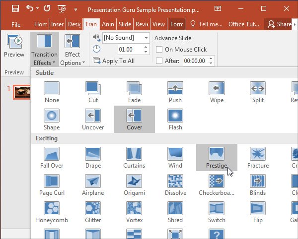
Transitions: The difference between animations and transitions is that the latter loads a slide with an effect and the former is used to load slide elements. For example, if I was to add the Curtains transition to a slide, it would load with the curtains effect on-screen to reveal the slide.
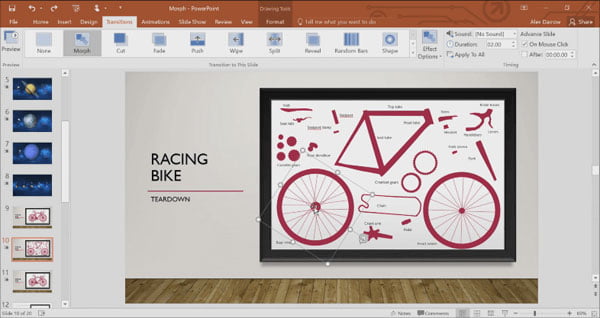
Morph: PowerPoint has introduced a revolutionary transition effect called Morph. This transition enables presenters to animate multiple parts of a slide which animate as you switch to the slide. For example, if you have a diagram of the solar system, you can enable all planets to animate automatically as you switch to the slide with that diagram. Morph is revolutionary in the sense that it can enable end users to create complex animations by simply applying the Morph transition. This also means that in coming years we might see the difference between animations and transitions blur in PowerPoint. Please note however that while you can play Morph transitions in PowerPoint 2016, you cannot create them in it. To create them you would need an Office 365 subscription or PowerPoint 2019.
Advanced Features of PowerPoint 2016
PowerPoint can be quite intimidating for novice users. PowerPoint beginners often get a bit overwhelmed by the seemingly infinite options that pop out of nowhere in the Ribbon menu. Then there is the worry of messing up a slide deck after you’ve done the hard work. For example, after applying an animation many people might not know how to remove it via the Animations Pane, which is revealed via the Animations tab. This also means that many presenters avoid playing around with their slides to play it safe.
To help beginners get rid of their paranoia and to give some ideas to intermediate and Power Users (pun intended); we have compiled a list of some of the advanced features of PowerPoint 2016. This guide touches upon some of the most underused features of PowerPoint, with special emphasis on some of the latest advanced features that have been introduced in PowerPoint 2016 to supercharge PowerPoint.
[This article contains affiliate links. For more information, see our disclosures here.]
SLIDE MASTER, HANDOUT MASTER & NOTES MASTER
In my experience, many people simply don’t know what Master Views are. Even if they have an idea, they might not want anything to do with them to avoid the wrath of the PowerPoint Ribbon menu.
Slide Master: Slide Master is one of the most advanced features of PowerPoint and many of us benefit from it one way or another. This is because this feature is quite important for making PowerPoint templates, which all of us love using without a second thought. After all, why would anyone design their slide deck from scratch!
A Slide Master is a slide which contains information about the whole theme. It is the top slide which contains information about the background, fonts, colors, placeholders, etc.
Every presentation is supposed to have at least one Slide Master, which is why it becomes so hard for some users to modify individual slides with different background designs. This is because changes made to the slide master applies universal changes to every slide in the presentation. You can modify slide master by going to View –> Slide Master, located in the Master Views menu.
Handouts Master: There is also a Handout Master and Notes Master. As the names suggest, these options allow you to enter master view for managing the layouts for your handouts and notes. As you might be aware, you can print handouts in PowerPoint to give a copy of your slides to people in your audience. With the Handout Master option, you can comprehensively edit the layouts for your handouts.
Notes Master: Some presenters like using speaker notes to remind them of key points tied to their slides. Using Notes Master, you can even make more than just text based notes by adding background styles and themes.
PowerPoint 2016 pretty much has the same features for Master Views as its predecessors. The reason we mentioned this feature in this post is because of its importance as an advanced feature.
The next time you want to add branding to multiple slides or configure layouts for your presentation, notes or handouts, you might want to check out Master Views to save yourself the hassle of editing multiple slides, notes and handouts individually.
ANIMATIONS & TRANSITIONS
Animations and Transitions are one of the most underused features of PowerPoint. These can be used for making animated presentations, where you can load slides and slide elements with the help of various effects.
Animations: The Animations tab in PowerPoint contains a number of animations that you can apply to your slides. The easiest way to add one is to select a slide element, go to the Animations tab and select an animation effect from the given menu. This will allow you to load your selected slide object (e.g. text or an image) with an effect such as Zoom, Wipe, Swivel, etc. You can remove these animations anytime via Animations –> Animations Pane.
Not much has changed for Animations in PowerPoint 2016 and like before, you can also add a time for loading your animations, reorder them and set triggers. Something I personally noticed about Animations in PowerPoint 2016 is the smoother loading of added animations. This could be due to under the hood changes which arguably make PowerPoint 2016 run smoother than its predecessor.
Transitions: The difference between animations and transitions is that the latter loads a slide with an effect and the former is used to load slide elements. For example, if I was to add the Curtains transition to a slide, it would load with the curtains effect on-screen to reveal the slide.
Morph: PowerPoint has introduced a revolutionary transition effect called Morph. This transition enables presenters to animate multiple parts of a slide which animate as you switch to the slide. For example, if you have a diagram of the solar system, you can enable all planets to animate automatically as you switch to the slide with that diagram. Morph is revolutionary in the sense that it can enable end users to create complex animations by simply applying the Morph transition. This also means that in coming years we might see the difference between animations and transitions blur in PowerPoint. Please note however that while you can play Morph transitions in PowerPoint 2016, you cannot create them in it. To create them you would need an Office 365 subscription or PowerPoint 2019.
ADDING APPS TO POWERPOINT
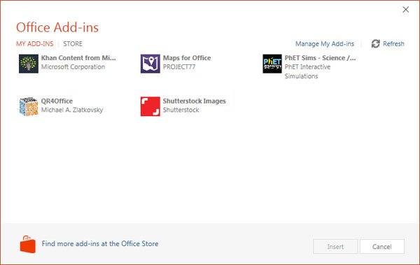
You might have installed a PowerPoint add-in but it’s likely that you haven’t yet used apps from the Office Store. PowerPoint, Word & Excel now have a number of handy apps that you can fetch directly from the Office Store. There are two ways of adding these apps.
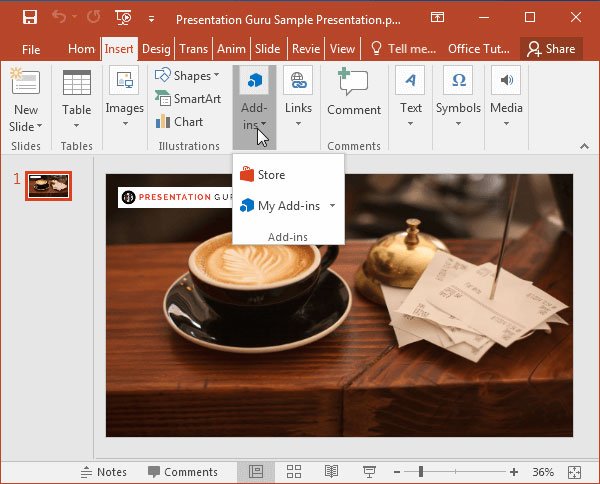
Method 1: To add an app to PowerPoint 2016, go to Insert –> Add-ins –> Store, select and select app to install.
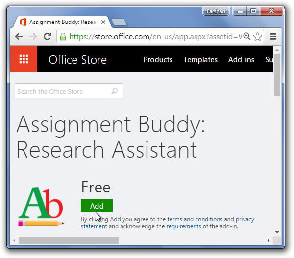
Method 2: Alternatively, you can add an app to PowerPoint by going to the Office Store via browser, select an app and login with your Microsoft account. Whenever you use this account to log into PowerPoint (2013 or 2016), Office 365 or PowerPoint Online, your app will become available. These apps work pretty much like PowerPoint add-ins, however, most of them require an internet connection to work.
Office Store apps are actually add-ins with the difference that you don’t have to install them on your computer. These apps work with one or more of the following: PowerPoint, Word, Excel, Project, Outlook & SharePoint.
PowerPoint apps at the Office Store usually work with PowerPoint 2013 and PowerPoint 2016. However, some apps are also compatible with Office 365 and PowerPoint Online.
POWERPOINT DESIGNER
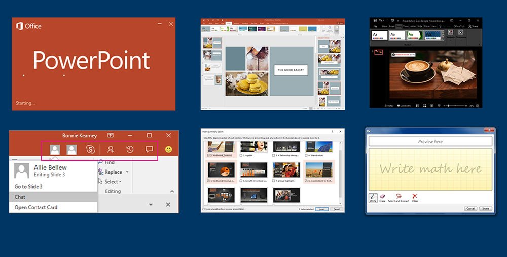
PowerPoint has unveiled an excellent design feature for PowerPoint 2016, known as the PowerPoint Designer. This feature provides automatic design suggestions when you add an image to your slides. The first time you add an image, you are given the option to enable PowerPoint Designer; click ‘Let’s Go’ to initiate this feature. Once enabled, PowerPoint Designer instantly provides a number of ideas for inserting your image to your slide, with a number of professional looking layouts.
The reason this is such a good feature is that it makes use of something that can be deemed as artificial intelligence to give you design ideas that would otherwise require the eye of an expert graphic designer. Unfortunately, PowerPoint Designer only works with default PowerPoint templates and images larger than 200 x 200. The supported image formats include; JPG, PNG, BMP, as well as GIF animations.
For now, you will need an active internet connection and an Office 365 subscription for this feature to work with PowerPoint 2016. It is likely that this might become more readily available in coming days for non-subscribers but for now that doesn’t seem to be the case.
ZOOM FOR POWERPOINT
This is another fine feature which comes with PowerPoint 2016. Zoom for PowerPoint enables you to jump between slides, sections and portions of your presentation in a flash. You can create a zoom by going to Insert –> Zoom in PowerPoint 2016. There are three kinds of Zooms that you can create, i.e. Summary Zoom, Slide Zoom and Section Zoom.
Note: Zoom is a new feature that was introduced in July, 2016. It is currently only available for Office 365 subscribers using PowerPoint 2016
REAL-TIME COLLABORATION OPTIONS
There are a number of enhanced collaboration features in PowerPoint 2016. You can now instantly collaborate with other users in real-time and even see what section each user is working on by sharing your presentations via OneDrive or SharePoint. Furthermore, you can chat with people using Skype for Business right from within PowerPoint. Moreover, you can track activity of people collaborating on your presentation using the Activity Pane.
You can also add comments to presentations to give your input regarding a presentation or if you’re using PowerPoint for brainstorming or making a project plan; you can get expert help or inter-departmental input.
Note: Many of the above mentioned features require an Office 365 subscription.
SCREEN RECORDING
PowerPoint has had handy options for taking screenshots, inserting videos and audio for quite some time. However, now you can record screencasts right from within PowerPoint. Just go to Insert –> Screen Recording and you can begin recording parts of your screen for making videos which can even be included in your slides.
Note: You can also get this feature for PowerPoint 2013 if you have installed the latest updates.
INK EQUATIONS
Inserting complex math equations in PowerPoint has become easier with PowerPoint 2016. Now you can include complex mathematical equations via Insert –> Equations –> ink Equations. This feature allows you to use a touch device to write math equations using your finger or a touch stylus. PowerPoint will convert these equations to text automatically. In case you don’t have a touch device, you can also use your mouse to write equations.
SWITCH BETWEEN COLORFUL, WHITE, GREY & BLACK THEME
Theme contrast is an essential part of displaying your content. While many people might prefer the default colorful theme, PowerPoint now offers a highest contrast black theme, as well as a grey and white theme that you can use for your presentations.
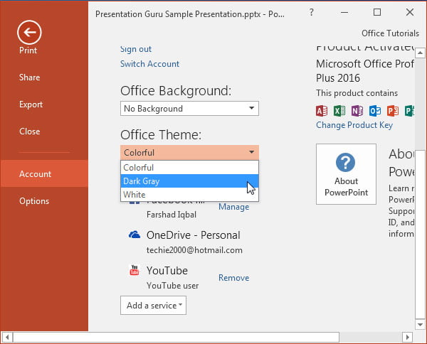
You can switch your theme from high to low contrast or vice versa by going to File –> Account –> Office Theme.
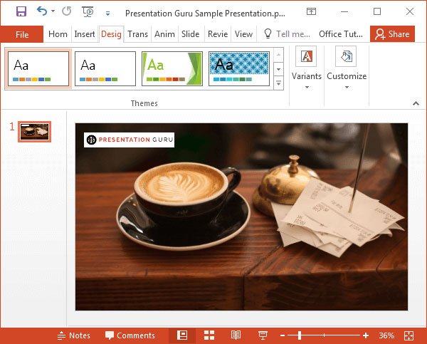
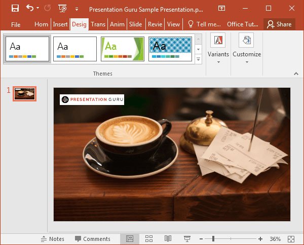
The default theme is light grey (Colorful Theme), while the Dark Grey theme gives a higher contrast. You can also opt for the highest contrast Black Theme or the plain White Theme.
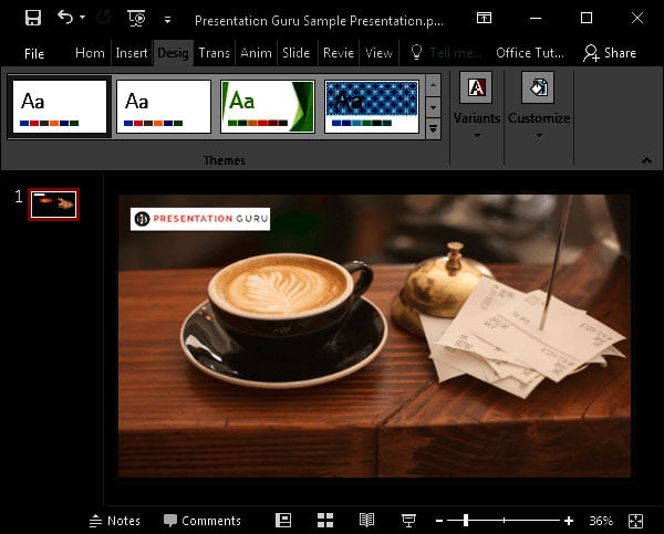
Black Theme: Here is a look at the highest contrast black theme. This theme can be quite useful for emphasizing your slides, provided your slide content has lighter color tones.
Note: The highest contrast black theme is only available for users with an Office 365 subscription.
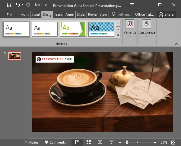
Grey Theme: The below image shows the grey theme. This theme is lower in contrast than the Black Theme but higher in contrast than the Colorful and White Theme.
White Theme: Here is a look at the White Theme, which you might be surprised to know is not the default theme.
Colorful Theme: The default theme is the Colorful Theme, which has a somewhat light grey color tone.


Comments
Post a Comment